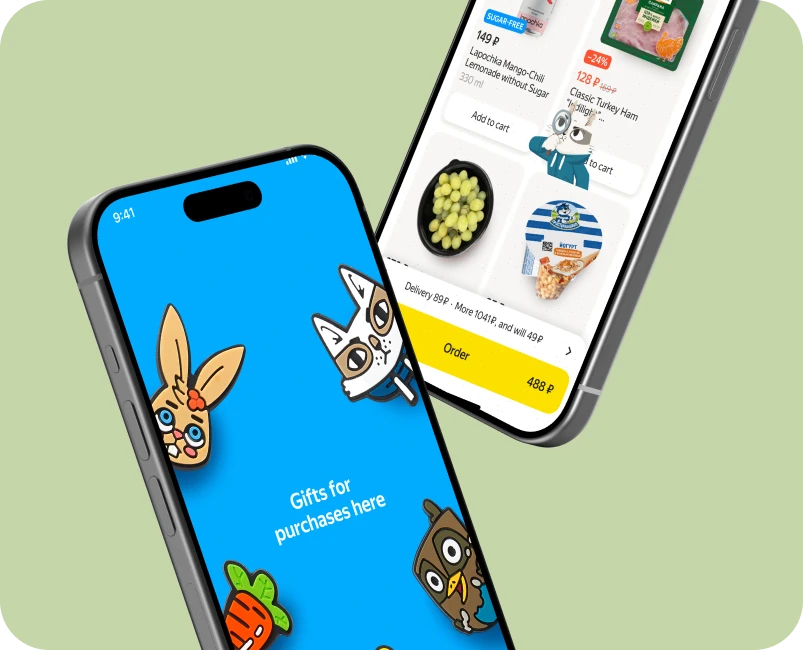
Yandex Lavka — Promotional Campaign
Designing a playful in-flow promotion that turned a brand campaign into measurable business and engagement impact
 Back
Yandex Lavka is a large-scale grocery delivery product.
Research A/B tests showed that personalized recommendations on the homepage significantly increase GMV and basket diversity.
However, the homepage had limited space to highlight new features, promotions, and monetization opportunities as the business scaled.
Senior Product Designer.
I owned the design process end to end: problem framing, research synthesis, concept development, experimentation, and collaboration with product, research, and engineering teams.
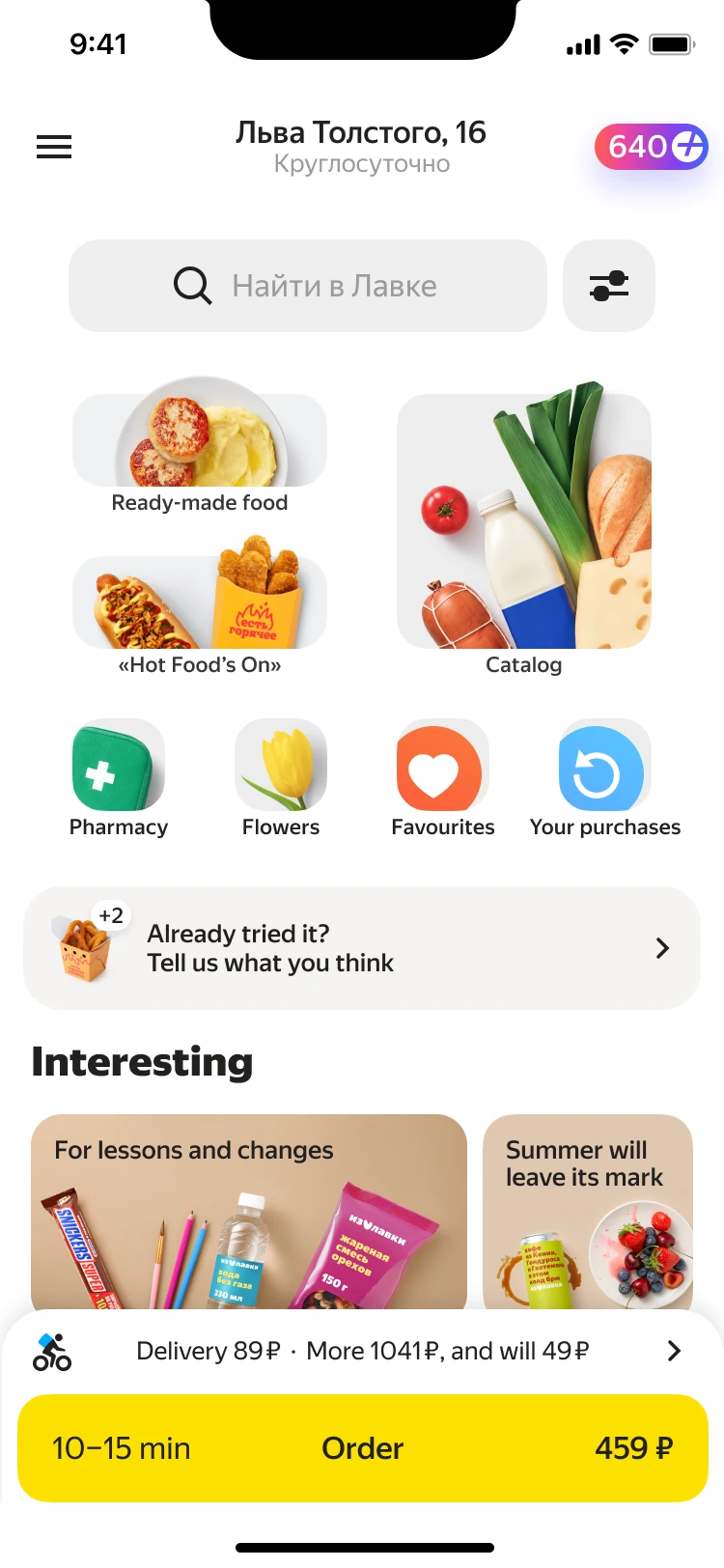
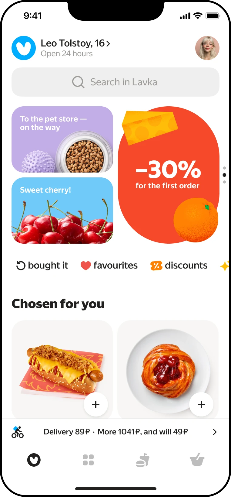
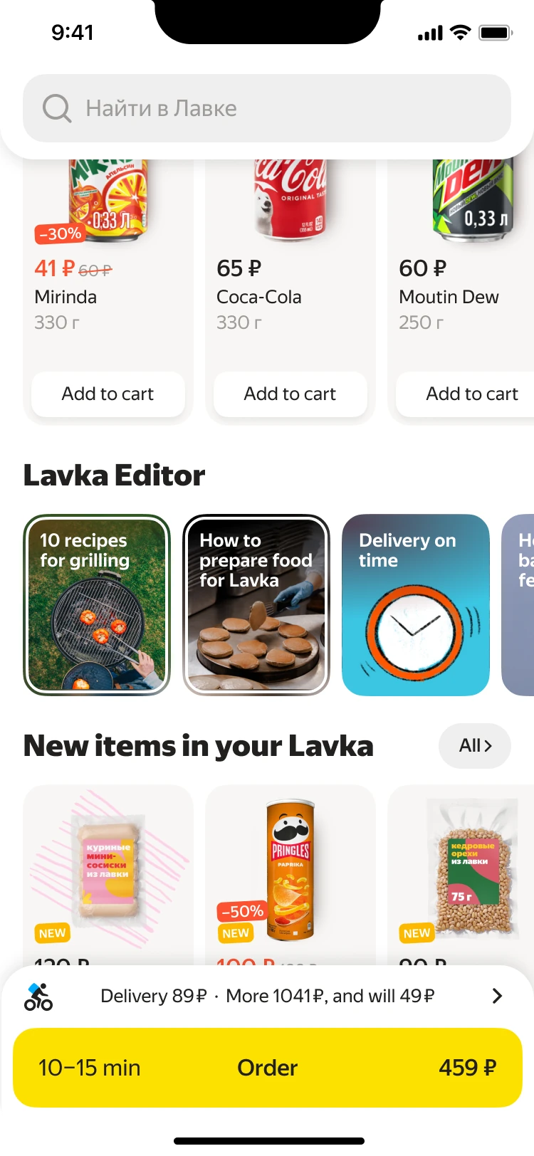
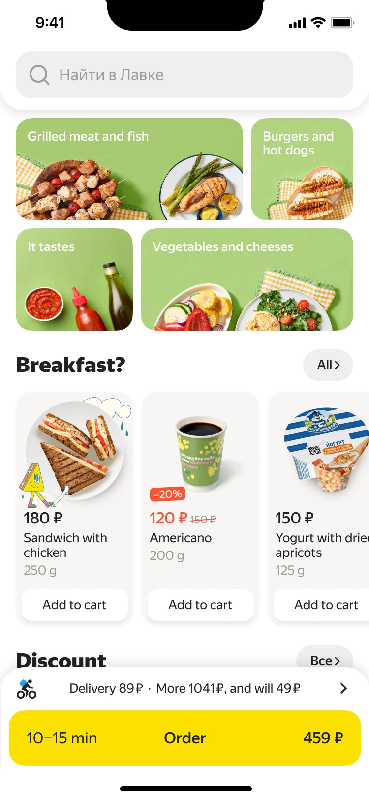
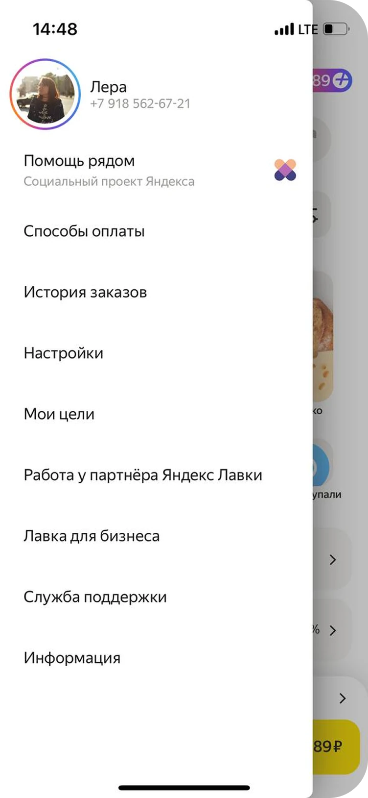
That was
before
Users rarely scrolled the homepage.
Promotional banners and feature highlights placed below the first screen were largely ignored.
At the same time, recommendations proved to be a strong growth driver when surfaced early
Qualitative research and analytics showed that users focus almost entirely on the first screen.
Research experiments confirmed that moving recommendations into the first screen doubled purchase conversion from the homepage.
This is the Welcome zone, which immerses the customer in a cool assortment, discounts, unusual offers, and a shopping and new product inspiration feed;
The main place for the most important communications and partner integration: new opportunities, big discounts, and large promotions;
Endless immersion, more entertainment content: stories, advertising banners, festivals, collections, interest-based recommendations, mostly about impulse purchases;
Systemic: The shop is broken, the courier is late, and the refrigerator is not working. All of these signals should not look like a promo, but rather be short, informative, and systemic.
Technical — in the signal. Promo — tape or industrial unit. Settings/evaluation — in the profile.
The order status informer remains on the main page
The photo’s background, animation, and overlay don’t conflict with each other, and if we use animation, it has a limited display time, well-thought-out rules, and supports storytelling.
Technical — in the signal. Promo — tape or industrial unit. Settings/evaluation — in the profile.
The order status informer remains on the main page


 ━━━ ━━━
I proposed restructuring the homepage layout to surface recommendations higher while supporting multiple business goals.
However, the challenge went far beyond layout changes — it required rethinking promo blocks, aligning stakeholder goals, and designing scalable solutions for multiple business areas.
Redesigned navigation into a familiar horizontal tab-based format to free space for recommendations.
Introduced a dedicated promo block as a scalable alternative to a traditional feed.
Consolidated fragmented promo carousels into compact, structured blocks.
Designed a mixed media feed where content and products coexist, driven by user interests.
Due to the scale of the redesign, we worked iteratively, validating each step through experiments and gradually shaping the final solution.
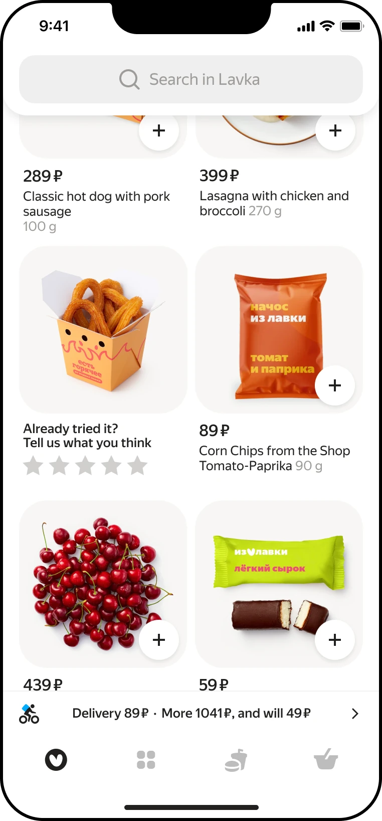
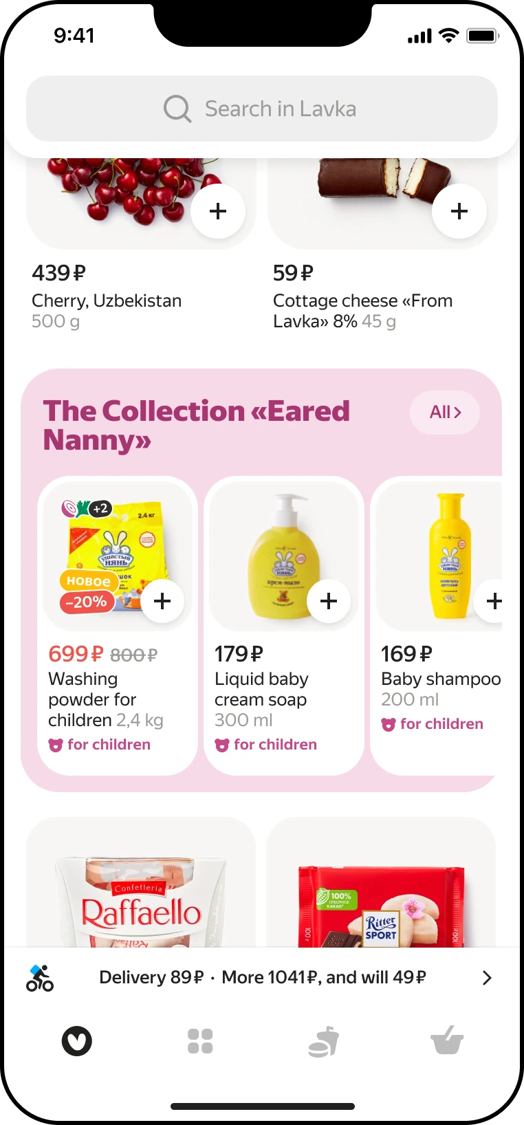
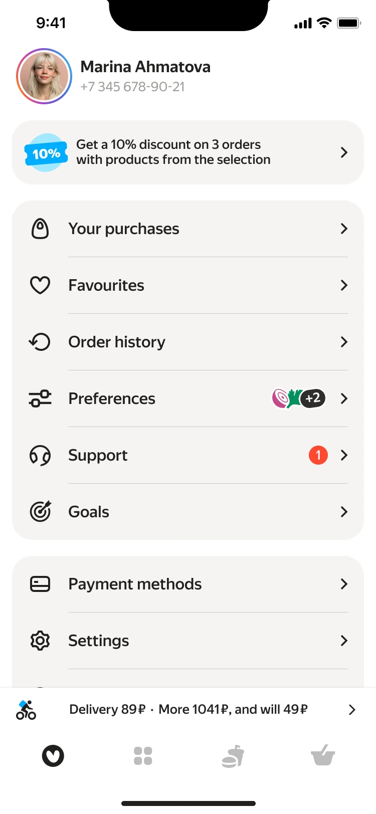
Personalized product feed powered by ML models delivered a stable +3.4% GMV uplift.
Premium promo placements contributed 24% of the annual advertising revenue target.
Promo block successfully supported seasonal campaigns and new feature launches.
The bottom tab bar did not increase metrics, but also did not negatively affect performance — project goals were achieved without regression.
This project strengthened my system-level design thinking and process ownership skills.
I worked closely with researchers, engineers, and stakeholders to balance user needs, business metrics, and long-term scalability.
Designing a playful in-flow promotion that turned a brand campaign into measurable business and engagement impact
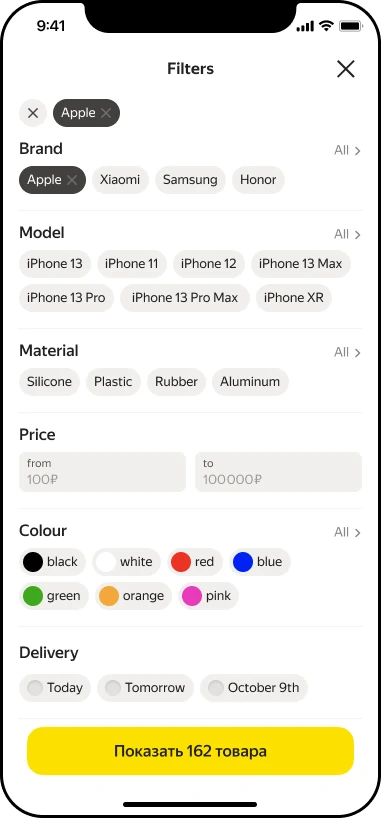
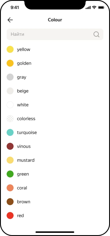
Redesigning marketplace filters to increase relevance and drive conversion — boosting filter usage from 4% to 18% and delivering a +2% GMV uplift.
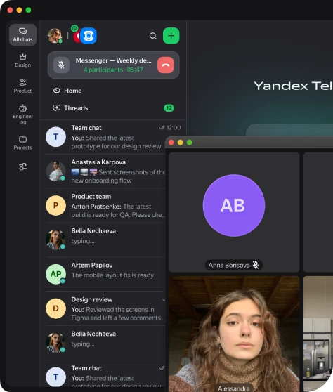
I shaped the design strategy for unifying calls and messaging across web and desktop, aligned designers and engineers